Photography Website Conversion Audit: Why Portfolio Traffic Is Not Becoming Enquiries
Audit your photography website for traffic quality, portfolio proof, pricing cues, CTAs, form friction, mobile speed and lead tracking to win more enquiries.

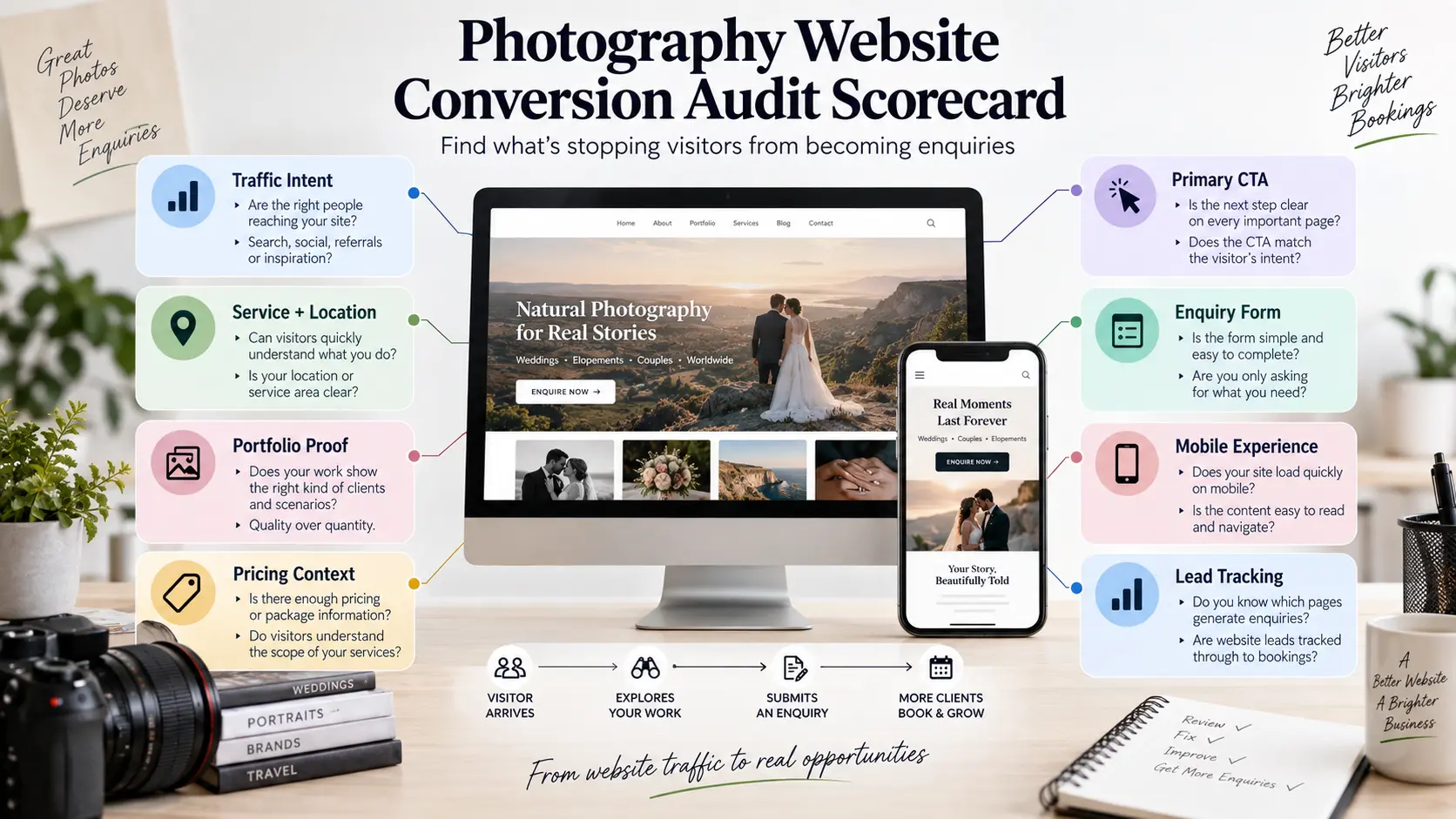
Traffic can make a photography website look healthier than it really is. Search Console shows impressions and clicks, Instagram sends visitors to the portfolio, venue pages generate referrals, and people browse recent work. Yet the enquiry inbox remains quiet.
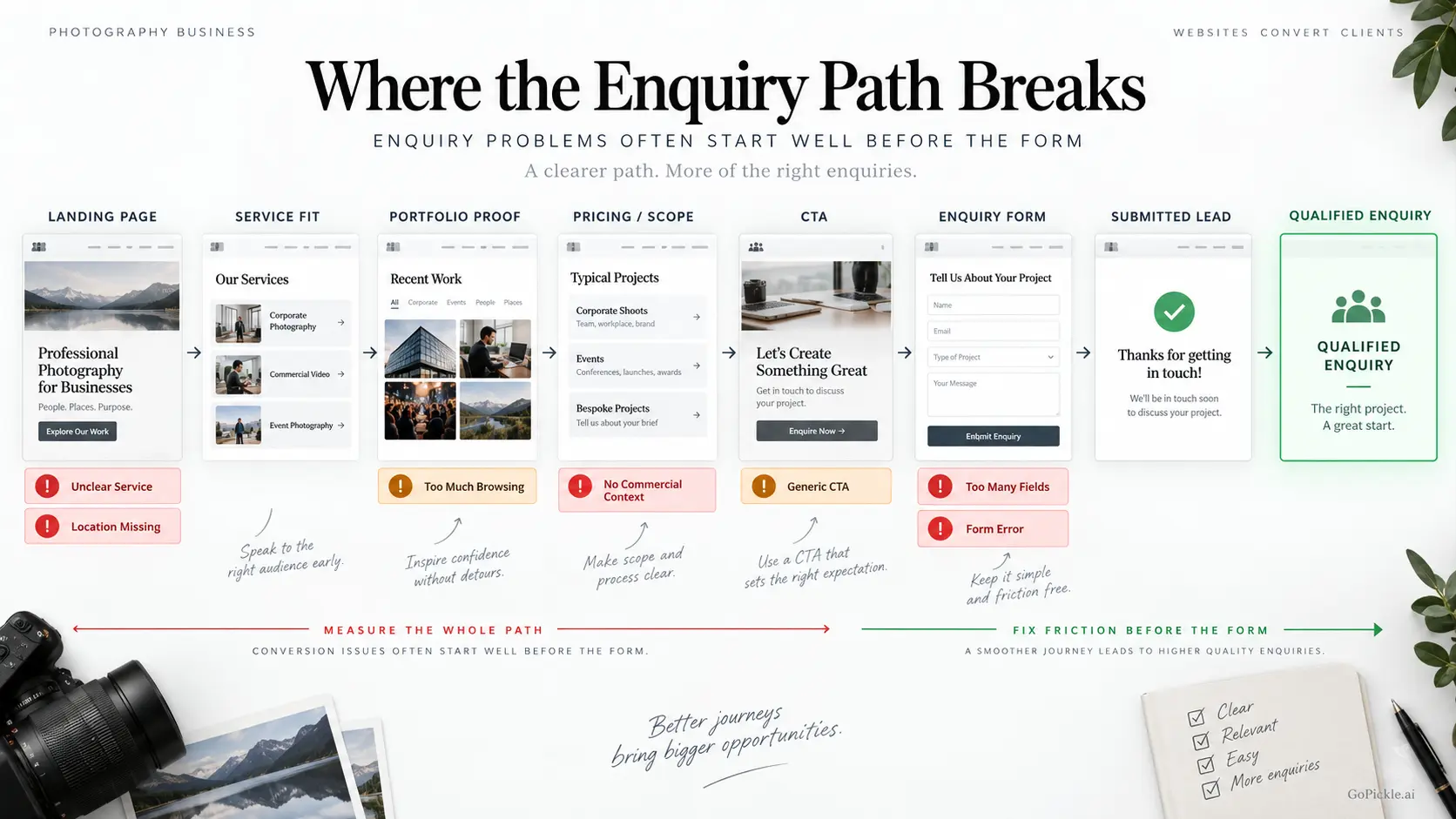
When a photographer website is getting visitors but not enquiries, adding more photographs is rarely the first thing we would fix. The problem is usually somewhere between arrival and action. The visitor may have landed with the wrong intent, may not understand what you photograph or where you work, may like the images but have no idea whether the service fits their budget, or may abandon a slow mobile page or unnecessarily demanding enquiry form.
A photography website conversion audit examines that complete path. Rather than asking whether the site looks attractive, it asks whether a potential client can confidently move from “I like this work” to “This photographer fits my requirement, and I know what to do next.”
Confirm that the right people are reaching the page
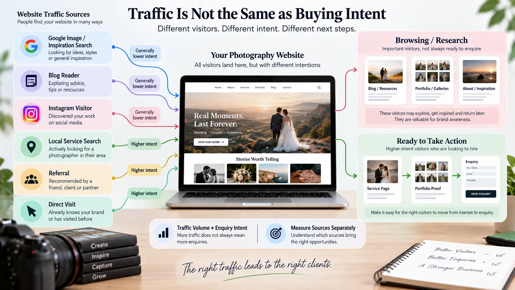
Before changing buttons, forms or homepage copy, establish what kind of traffic you actually have. A photography website can attract substantial traffic without attracting many people who are currently looking to hire a photographer.
Someone searching for “sunset wedding photography ideas” may browse a gallery for inspiration. Someone searching for “corporate event photographer in Manchester” is much closer to making a commercial decision. A visitor clicking an image from Google Images may behave differently from a prospect arriving on a service page after searching for a photographer in their city.
Group your traffic by source and landing-page intent. Look separately at homepage visits, service pages, portfolio galleries, location pages, articles and direct visits. Then ask what action would realistically make sense for someone landing there.
This is particularly important for photographers investing in SEO. Ranking for broader photography topics can create useful awareness, but it should not be confused with high-intent traffic. GoPickle's guide to local SEO for photographers explains how service and location intent differ from general photography discovery.
Do not start a website redesign because the overall photography website conversion rate looks low. First find out which pages are attracting potential clients and whether those people are progressing toward an enquiry.
Can a visitor identify your service and location immediately?
Open your website in a private browser window and pretend you have never heard of the studio. Ignore what you already know about the business.
Within the first screen, can you tell what the photographer actually sells?
A headline such as “Turning moments into memories” may suit the brand voice, but it does not tell a new visitor whether the business photographs weddings, products, architecture, babies or conferences. A spectacular hero photograph does not always answer the question either. A destination-wedding photograph could belong to a wedding specialist, travel photographer, venue photographer or editorial photographer.
The first meaningful section should establish the primary service, the geographical context where location matters, and the next useful action. A studio might say it provides documentary wedding photography from a particular city and travels internationally. A commercial photographer might describe product and campaign photography for brands across a region. A photographer working remotely or travelling worldwide should explain that instead of adding an artificial local signal.
Location is particularly important when the search itself carries local intent. Make the actual studio base, service area or travel model clear rather than forcing visitors to search the footer or contact page. Avoid filling the page with city names purely for SEO.
Our detailed guide to what a photography website should show above the fold covers homepage composition in more depth. During a conversion audit, the simpler test is this: can the right client identify the service, relevant location and next step before uncertainty sends them elsewhere?
Portfolio proof is different from an endless portfolio
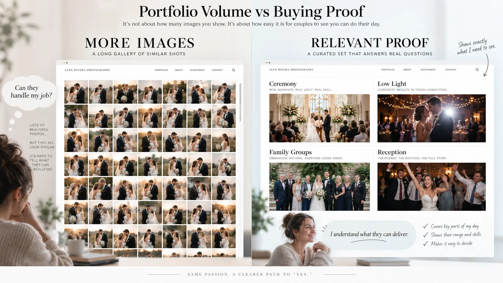
Photographers understandably judge websites through photographs. Clients use photographs differently. They are looking for evidence that you can handle their particular job.
Thirty exceptional but nearly identical couple portraits may demonstrate a visual style, yet tell a wedding client little about ceremony coverage, difficult lighting, family groups or reception photography. A commercial portfolio containing only dramatic hero shots may leave a marketing team wondering whether you can produce a complete set of consistent deliverables.
Review every important service page and ask what the images prove.
The objective is not to show everything. It is to remove the client's biggest uncertainty about hiring you. That may mean showing different parts of a wedding day, several products from one campaign, conference stages and networking coverage, a range of portrait subjects, or examples from the venues and locations you regularly serve.
Long galleries also have a practical cost. They increase browsing effort and can make image-heavy pages harder to deliver efficiently on mobile. Select enough work to demonstrate consistency, then give visitors a reason to continue toward the service details or enquiry route.
If you are rebuilding the portfolio itself, use our separate guide on how to build a photography portfolio that converts visitors into enquiries. This audit is concerned with a different question: is the portfolio currently helping the visitor make a buying decision, or merely giving them more images to scroll through?
Give clients enough pricing and scope context to decide whether to enquire
A photography website does not necessarily need to publish a complete rate card. It does need to prevent the prospective client from feeling that an enquiry is a blind commitment.
Review what your site communicates about the shape of the service. A wedding client may need to understand whether coverage can include multiple events, photographers, albums or films. A portrait client may want to know how sessions differ and what is delivered. A commercial buyer may need context around shoot duration, usage, production requirements and custom estimating.
Pricing cues can also help. Depending on the business model, that could be a starting price, package range, minimum engagement, example package, or a clear explanation that quotations depend on specific factors. The correct approach varies between markets and photography sectors. The objective is not maximum transparency for its own sake. It is enough commercial context for a suitable prospect to decide that starting a conversation is worthwhile.
If visitors repeatedly reach the pricing or services area and disappear without enquiring, inspect the gap between what they know and what you are asking them to do next. “Contact for pricing” tells them very little. “Tell us your date, location and coverage requirement and we will prepare a quotation” explains the next step without forcing you to publish a fixed price.
Audit every CTA and remove inquiry-form friction
A photography website often accumulates buttons over time: Contact, Learn More, View Portfolio, Get in Touch, Book Now, Pricing, Let's Talk, Check Availability. None is inherently wrong, but a page with several competing actions can leave the visitor without a clear primary path.
Match the call to action to the decision being made. Check Availability makes sense for date-dependent work. Request a Quotation is clearer for commercial requirements. Enquire About Your Wedding is more specific than Contact Us. The wording should accurately describe what happens after the click.
Then test the enquiry form yourself, on a phone, without autofill.
A first enquiry usually needs enough information to start a useful conversation, not everything required to produce the job. Name, contact method, photography requirement, date when relevant, location and a short description will cover many situations. Additional fields should earn their place. If you need a budget range to qualify work, ask it deliberately. If you do not need an exact guest count, detailed schedule and twelve dropdown selections before responding, do not make the prospect provide them.
Check the mechanics as well. Submit the form. Confirm that validation works, the success state is visible, the message reaches the correct destination, and the visitor understands what will happen next. Test telephone and email links. Test from more than one mobile browser. A beautiful photography website with a broken form has a conversion rate of zero for the visitors who reach it.
Test mobile speed and readability with the actual portfolio pages
Photography websites carry unusually heavy visual assets, so the homepage is not enough for a performance test. Audit the service and gallery pages that potential clients really visit.
Google's current Core Web Vitals guidance uses three primary measures of real-world page experience: Largest Contentful Paint for loading, Interaction to Next Paint for responsiveness, and Cumulative Layout Shift for visual stability. The current “good” thresholds are LCP within 2.5 seconds, INP below 200 milliseconds and CLS below 0.1.
Treat those as technical diagnostic targets rather than a promise that faster pages automatically create enquiries.
For a photography website audit, pay particular attention to oversized hero images, unnecessarily large gallery files, autoplay media, scripts from third-party widgets, layout shifts while photographs load, and mobile menus or buttons that are difficult to use. Serve appropriately sized images, compress them responsibly, and lazy-load below-the-fold media where suitable rather than making the initial page carry an entire portfolio.
Then read the page on a phone rather than merely testing its speed. Check font size, contrast, line length, spacing, sticky elements, cookie banners, gallery navigation and enquiry fields. A layout designed around a large desktop monitor may technically be responsive while still being unpleasant to use.
Google now crawls and indexes sites using its smartphone crawler, which makes mobile content and accessibility to the crawler important for search visibility as well as user experience.
Track the enquiry source and the page path
Once the website is usable, start measuring the path to the enquiry rather than traffic alone.
For each important source, try to understand:
Traffic source → Landing page → Service/portfolio interaction → Enquiry action → Submitted lead
You do not need an elaborate attribution system to learn something useful. At minimum, know which pages receive high-intent traffic, which pages send people toward the enquiry route, where form submissions originate and which enquiries eventually become worthwhile opportunities.
The last part matters. Ten enquiries for work you do not offer can be less valuable than three well-matched enquiries for your primary service. Photography website leads should eventually be connected to sales outcomes, not counted only as form submissions.
Once someone contacts the studio, GoPickle's lead management software for photographers can keep the enquiry source, requirement, owner, expected opportunity and next follow-up attached to the lead as it progresses toward quotation and booking. This is where website conversion analysis becomes commercially useful: you can stop asking only which page generated enquiries and start learning which sources generate the kind of enquiries your studio actually wants.
A practical photography website conversion audit scorecard
Use this as a first-pass audit before commissioning a redesign:
| Audit question | Pass when… | Investigate when… |
|---|---|---|
| Traffic intent | Important pages attract people searching for services you actually sell | Traffic is dominated by inspiration, unrelated images or irrelevant searches |
| Service clarity | A new visitor quickly understands what you photograph | The homepage relies mainly on branding language and images |
| Location clarity | Your real base, service area or travel model is understandable | Visitors must search for where you operate |
| Portfolio proof | Images demonstrate the work required for the service | Galleries are large but repetitive or disconnected from the offer |
| Commercial context | Visitors understand packages, scope or quotation logic | They must enquire without any idea how the service is structured |
| Primary CTA | Each important page has a logical next action | Several equally prominent buttons compete for attention |
| Enquiry form | The form requests enough information to begin the sale | The form feels like a full client onboarding questionnaire |
| Mobile experience | Portfolio, copy, navigation and forms work comfortably on phones | Desktop design is merely squeezed onto a smaller screen |
| Performance | Important pages load and respond efficiently | Large media or scripts delay the buying path |
| Lead attribution | Website enquiries retain their source and context | Every enquiry becomes an isolated email or message |
The purpose of the scorecard is not to produce an arbitrary website score. It is to identify the first point at which a suitable potential client loses confidence, context or momentum.
A strong photography website does not need to pressure visitors into contacting you. It needs to make the decision easier. At GoPickle, we think of the website as the front of a longer client workflow: discovery creates interest, the website establishes fit, the enquiry captures intent, and the studio's sales process takes responsibility from there.
If portfolio traffic is already arriving, that is useful. The next job is to make sure the right visitors can understand what you offer, trust the evidence, judge whether the service fits, and reach the enquiry stage without unnecessary friction.